Drink beer and solve (design) problems
scott smith owns east end brewing co. - and produces some of the most known and enjoyed beers in pittsburgh. EEBC is one of the forefront local breweries of the craft beer movement that has swelled here in the past decade. ive learned a ton from scott over the years we have been working together. (in fact, i think i owe a whole post to his side comment years ago of "make beer, sell beer" - but that will have to wait for now). all that aside, one of the most flattering aspects of working together has been the trust we have gained from him in aspects relating to design, branding, marketing, and the visual aspects of getting things done and noticed.
...to the extent, that he asked us to redesign his/their logo. thats a huuuuuge request and not something we took lightly. its kind of like talking all kinds of shit and then someone says, alright smartass - prove it.
we felt the main goal was to speak to their history but in a contemporary and lasting way. EEBC made its mark in kegs and growlers. ive been there a 2 jazillion times to fill up a growler(s) or snag kegs. so, take those ideas and make a substantial icon. something bold. something that can stand alone....that over time could be boiled down to lose the text altogether and we would all still know exactly who that mark belongs to. keep the earth tone color pallet to hold down the concept that this is an age old product derived from natural ingredients.
to preserve his old "sunrise behind the pint concept" from his original logo, the sun becomes a keg cap, the pint becomes a growler. cleaner, bolder, sturdy ...and approved
from this:

to this:

and no sooner than that gets the greenlight and starts going out on everything across the board - scott fills us in on some events he has coming up inside his actual brewery ... AND asks if could we help "just make the place look cooler".
so we do.
we come up with the idea then - mockup a plan for approval to readdress the colors of the walls, introduce and highlight the brand new logo, emphasize the frog from his flagship beer "Big Hop", and top it all off with his "buy a good friend a good beer" tag line, right above the doorway.
then we offer to install it all. old school. paintbrushes and forklifts.

and it was awesome.

during the install scott asked if we could mark "caution" on a small ramp that leads into the brewery that becomes slippery when it gets wet. so we do, in our own style...way efficient and suuuuuuper cost effective using skateboard grip tape (thanks troika skateboards):

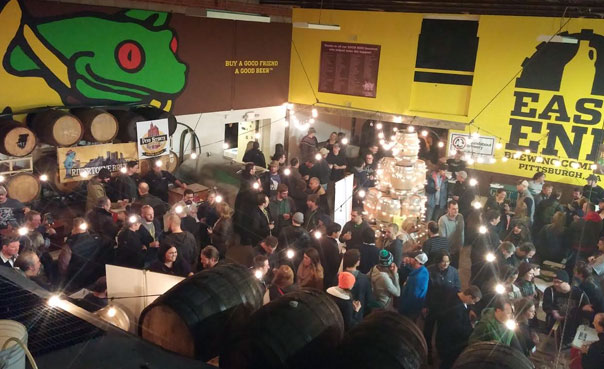
and we got this done all in time for EEBC's "good wood barrel aged beer" festival this past weekend. it was an awesome event and felt pretty damn good every time i saw someone pose in front of any of these massive icons for a pic - memories for them, branding for EEBC, and proof positive that we get shit done...
and even more - have the most fun doing it.